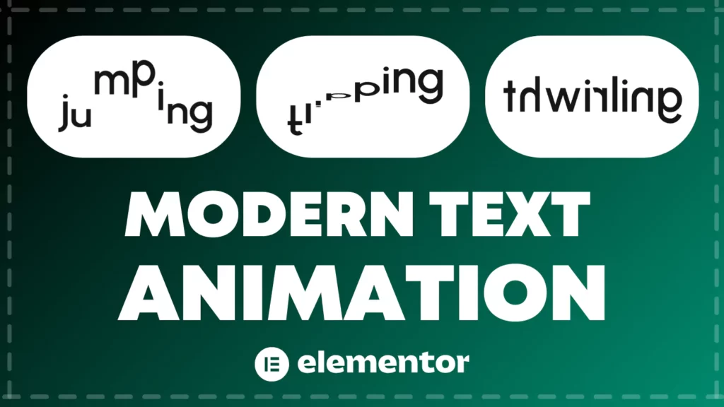
Tired of static, boring headlines? Want to make your WordPress website truly stand out? In our latest video tutorial, we unveil the secrets to creating stunning modern text animations in Elementor – and the best part? You don’t need any plugins!
This step-by-step guide is perfect for Elementor beginners and pros alike who are looking to add dynamic visual effects into their website. We break down the process of creating captivating text effects directly within Elementor’s free version, utilizing clever techniques and a touch of code to achieve professional-looking results.
What You’ll Learn to Create (Plugin-Free!):
- Dynamic Text Effects: Master animations like “Jumping,” “Floating,” “Jogging,” “Flipping,” “Twirling,” and “Falling” – all demonstrated in detail.
- Elementor Container Advanced: Learn how to structure your animations using Elementor’s flexible Container system for ultimate responsiveness across all devices.
- No Plugin Required: Discover how to achieve these impressive animations without relying on any paid or extra plugins, keeping your website lean and fast.
- Beginner-Friendly Approach: Our tutorial is designed for all skill levels, with clear, easy-to-follow instructions and code snippets provided.
- Boost Engagement: Captivate your audience and make your website more memorable with these eye-catching animated headlines.
Code Snippet For This Tutorial:
- Code Snippet For Jumping Animation:
<script src="https://unpkg.com/splitting/dist/splitting.min.js"></script>
<script>
  document.addEventListener('DOMContentLoaded', function() {
    Splitting({
      target: '#jumping-text', // Target ID of your "jumping" Basic Text widget
      by: 'chars' // Split text by characters
    });
  });
</script>
<style>
  /* CSS for .headline--jump animation - from style.css */
  .headline--jump .char {
    --name: jump;
    --dur: 800ms;
    --del: calc(var(--char-index) * 0.075s);
    --tf: cubic-bezier(0.165, 0.44, 0.64, 1);
  }
  @-webkit-keyframes jump {
    20% {
      transform: translateY(2%) scaleY(0.9);
    }
    40% {
      transform: translateY(-100%) scaleY(1.2);
    }
    50% {
      transform: translateY(10%) scaleY(0.8);
    }
    70% {
      transform: translateY(-5%) scaleY(1);
    }
    80%, 100% {
      transform: translateY(0) scaleY(1);
    }
  }
  @keyframes jump {
    20% {
      transform: translateY(2%) scaleY(0.9);
    }
    40% {
      transform: translateY(-100%) scaleY(1.2);
    }
    50% {
      transform: translateY(10%) scaleY(0.8);
    }
    70% {
      transform: translateY(-5%) scaleY(1);
    }
    80%, 100% {
      transform: translateY(0) scaleY(1);
    }
  }
  /* Base character styles (common for all animations, if not already defined globally) */
  .char {
    -webkit-animation-delay: var(--del);
            animation-delay: var(--del);
    -webkit-animation-direction: var(--dir, normal);
            animation-direction: var(--dir, normal);
    -webkit-animation-duration: var(--dur);
            animation-duration: var(--dur);
    -webkit-animation-iteration-count: var(--it, infinite);
            animation-iteration-count: var(--it, infinite);
    -webkit-animation-name: var(--name);
            animation-name: var(--name);
    -webkit-animation-timing-function: var(--tf);
            animation-timing-function: var(--tf);
    -webkit-animation-fill-mode: var(--fill, forwards);
            animation-fill-mode: var(--fill, forwards);
    display: inline-block;
    position: relative;
    transform-origin: 50% 100%;
    z-index: 1;
  }
</style>
2. Code Snippet For Floating Animation:
<script src="https://unpkg.com/splitting/dist/splitting.min.js"></script>
<script>
  document.addEventListener('DOMContentLoaded', function() {
    Splitting({
      target: '#floating-text', // Target ID of your "floating" Basic Text widget
      by: 'chars' // Split text by characters
    });
  });
</script>
<style>
  /* CSS for .headline--float animation - from style.css */
  .headline--float .char {
    --name: float;
    --dur: 2200ms;
    --del: calc(var(--char-index) * -0.5s);
    --tf: ease-in-out;
    --dir: alternate;
  }
  .headline--float .char:nth-child(2n) {
    --name: float-alt;
  }
  @-webkit-keyframes float {
    from {
      transform: translate(2%, -10%) rotate(-1deg);
    }
    to {
      transform: translate(-2%, 5%) rotate(3deg);
    }
  }
  @keyframes float {
    from {
      transform: translate(2%, -10%) rotate(-1deg);
    }
    to {
      transform: translate(-2%, 5%) rotate(3deg);
    }
  }
  @-webkit-keyframes float-alt {
    from {
      transform: translate(0%, -5%) rotate(-1deg);
    }
    to {
      transform: translate(2%, 10%) rotate(3deg);
    }
  }
  @keyframes float-alt {
    from {
      transform: translate(0%, -5%) rotate(-1deg);
    }
    to {
      transform: translate(2%, 10%) rotate(3deg);
    }
  }
  /* Base character styles (common for all animations, if not already defined globally) */
  .char {
    -webkit-animation-delay: var(--del);
            animation-delay: var(--del);
    -webkit-animation-direction: var(--dir, normal);
            animation-direction: var(--dir, normal);
    -webkit-animation-duration: var(--dur);
            animation-duration: var(--dur);
    -webkit-animation-iteration-count: var(--it, infinite);
            animation-iteration-count: var(--it, infinite);
    -webkit-animation-name: var(--name);
            animation-name: var(--name);
    -webkit-animation-timing-function: var(--tf);
            animation-timing-function: var(--tf);
    -webkit-animation-fill-mode: var(--fill, forwards);
            animation-fill-mode: var(--fill, forwards);
    display: inline-block;
    position: relative;
    transform-origin: 50% 100%;
    z-index: 1;
  }
</style>
3. Code Snippet For Jogging Animation:
<script src="https://unpkg.com/splitting/dist/splitting.min.js"></script>
<script>
  document.addEventListener('DOMContentLoaded', function() {
    Splitting({
      target: '#jogging-text', // Target ID of your "jogging" Basic Text widget
      by: 'chars' // Split text by characters
    });
  });
</script>
<style>
  /* CSS for .headline--jog animation - from style.css */
  .headline--jog .char {
    --name: jog;
    --dur: 500ms;
    --del: calc(var(--char-index) * -0.025s);
    --tf: linear;
  }
  @-webkit-keyframes jog {
    0% {
      transform: translate(0, 0) rotate(5deg);
    }
    25% {
      transform: translate(5%, -5%) rotate(10deg);
    }
    50% {
      transform: translate(5%, 0) rotate(15deg);
    }
    75% {
      transform: translate(10%, -5%) rotate(10deg);
    }
    100% {
      transform: translate(0, 0) rotate(5deg);
    }
  }
  @keyframes jog {
    0% {
      transform: translate(0, 0) rotate(5deg);
    }
    25% {
      transform: translate(5%, -5%) rotate(10deg);
    }
    50% {
      transform: translate(5%, 0) rotate(15deg);
    }
    75% {
      transform: translate(10%, -5%) rotate(10deg);
    }
    100% {
      transform: translate(0, 0) rotate(5deg);
    }
  }
  /* Base character styles (common for all animations, if not already defined globally) */
  .char {
    -webkit-animation-delay: var(--del);
            animation-delay: var(--del);
    -webkit-animation-direction: var(--dir, normal);
            animation-direction: var(--dir, normal);
    -webkit-animation-duration: var(--dur);
            animation-duration: var(--dur);
    -webkit-animation-iteration-count: var(--it, infinite);
            animation-iteration-count: var(--it, infinite);
    -webkit-animation-name: var(--name);
            animation-name: var(--name);
    -webkit-animation-timing-function: var(--tf);
            animation-timing-function: var(--tf);
    -webkit-animation-fill-mode: var(--fill, forwards);
            animation-fill-mode: var(--fill, forwards);
    display: inline-block;
    position: relative;
    transform-origin: 50% 100%;
    z-index: 1;
  }
</style>
4. Code Snippet For Flipping Animation:
<script src="https://unpkg.com/splitting/dist/splitting.min.js"></script>
<script>
  document.addEventListener('DOMContentLoaded', function() {
    Splitting({
      target: '#flipping-text', // Target ID of your "flipping" Basic Text widget
      by: 'chars' // Split text by characters
    });
  });
</script>
<style>
  /* CSS for .headline--flip animation - from style.css */
  .headline--flip .char {
    --name: flip;
    --dur: 4000ms;
    --del: calc(var(--char-index) * 0.075s);
    --tf: linear;
  }
  @-webkit-keyframes flip {
    5% {
      transform: rotateX(1turn);
    }
    10% {
      transform: rotateX(2turn);
    }
    20% {
      transform: rotateX(3turn);
    }
    40% {
      transform: rotateX(4turn);
    }
    70%, 100% {
      transform: rotateX(5turn);
    }
  }
  @keyframes flip {
    5% {
      transform: rotateX(1turn);
    }
    10% {
      transform: rotateX(2turn);
    }
    20% {
      transform: rotateX(3turn);
    }
    40% {
      transform: rotateX(4turn);
    }
    70%, 100% {
      transform: rotateX(5turn);
    }
  }
  /* Base character styles (common for all animations, if not already defined globally) */
  .char {
    -webkit-animation-delay: var(--del);
            animation-delay: var(--del);
    -webkit-animation-direction: var(--dir, normal);
            animation-direction: var(--dir, normal);
    -webkit-animation-duration: var(--dur);
            animation-duration: var(--dur);
    -webkit-animation-iteration-count: var(--it, infinite);
            animation-iteration-count: var(--it, infinite);
    -webkit-animation-name: var(--name);
            animation-name: var(--name);
    -webkit-animation-timing-function: var(--tf);
            animation-timing-function: var(--tf);
    -webkit-animation-fill-mode: var(--fill, forwards);
            animation-fill-mode: var(--fill, forwards);
    display: inline-block;
    position: relative;
    transform-origin: 50% 100%;
    z-index: 1;
  }
</style>
5. Code Snippet For Jumping Animation:
<script src="https://unpkg.com/splitting/dist/splitting.min.js"></script>
<script>
  document.addEventListener('DOMContentLoaded', function() {
    Splitting({
      target: '#jumping-text', // Target ID of your "jumping" Basic Text widget
      by: 'chars' // Split text by characters
    });
  });
</script>
<style>
  /* CSS for .headline--jump animation - from style.css */
  .headline--jump .char {
    --name: jump;
    --dur: 800ms;
    --del: calc(var(--char-index) * 0.075s);
    --tf: cubic-bezier(0.165, 0.44, 0.64, 1);
  }
  @-webkit-keyframes jump {
    20% {
      transform: translateY(2%) scaleY(0.9);
    }
    40% {
      transform: translateY(-100%) scaleY(1.2);
    }
    50% {
      transform: translateY(10%) scaleY(0.8);
    }
    70% {
      transform: translateY(-5%) scaleY(1);
    }
    80%, 100% {
      transform: translateY(0) scaleY(1);
    }
  }
  @keyframes jump {
    20% {
      transform: translateY(2%) scaleY(0.9);
    }
    40% {
      transform: translateY(-100%) scaleY(1.2);
    }
    50% {
      transform: translateY(10%) scaleY(0.8);
    }
    70% {
      transform: translateY(-5%) scaleY(1);
    }
    80%, 100% {
      transform: translateY(0) scaleY(1);
    }
  }
  /* Base character styles (common for all animations, if not already defined globally) */
  .char {
    -webkit-animation-delay: var(--del);
            animation-delay: var(--del);
    -webkit-animation-direction: var(--dir, normal);
            animation-direction: var(--dir, normal);
    -webkit-animation-duration: var(--dur);
            animation-duration: var(--dur);
    -webkit-animation-iteration-count: var(--it, infinite);
            animation-iteration-count: var(--it, infinite);
    -webkit-animation-name: var(--name);
            animation-name: var(--name);
    -webkit-animation-timing-function: var(--tf);
            animation-timing-function: var(--tf);
    -webkit-animation-fill-mode: var(--fill, forwards);
            animation-fill-mode: var(--fill, forwards);
    display: inline-block;
    position: relative;
    transform-origin: 50% 100%;
    z-index: 1;
  }
</style>
6. Code Snippet For Twirling Animation:
<script src="https://unpkg.com/splitting/dist/splitting.min.js"></script>
<script>
  document.addEventListener('DOMContentLoaded', function() {
    Splitting({
      target: '#twirling-text', // Target ID of your "twirling" Basic Text widget
      by: 'chars' // Split text by characters
    });
  });
</script>
<style>
  /* CSS for .headline--twirl animation - from style.css */
  .headline--twirl .char {
    --name: twirl;
    --dur: 6000ms;
    --del: calc(var(--char-index) * 0.025s);
    --tf: linear;
  }
  @-webkit-keyframes twirl {
    2.5% {
      transform: rotateY(1turn);
    }
    5% {
      transform: rotateY(2turn);
    }
    10% {
      transform: rotateY(3turn);
    }
    20% {
      transform: rotateY(4turn);
    }
    40% {
      transform: rotateY(5turn);
    }
    70%, 100% {
      transform: rotateY(6turn);
    }
  }
  @keyframes twirl {
    2.5% {
      transform: rotateY(1turn);
    }
    5% {
      transform: rotateY(2turn);
    }
    10% {
      transform: rotateY(3turn);
    }
    20% {
      transform: rotateY(4turn);
    }
    40% {
      transform: rotateY(5turn);
    }
    70%, 100% {
      transform: rotateY(6turn);
    }
  }
  /* Base character styles (common for all animations, if not already defined globally) */
  .char {
    -webkit-animation-delay: var(--del);
            animation-delay: var(--del);
    -webkit-animation-direction: var(--dir, normal);
            animation-direction: var(--dir, normal);
    -webkit-animation-duration: var(--dur);
            animation-duration: var(--dur);
    -webkit-animation-iteration-count: var(--it, infinite);
            animation-iteration-count: var(--it, infinite);
    -webkit-animation-name: var(--name);
            animation-name: var(--name);
    -webkit-animation-timing-function: var(--tf);
            animation-timing-function: var(--tf);
    -webkit-animation-fill-mode: var(--fill, forwards);
            animation-fill-mode: var(--fill, forwards);
    display: inline-block;
    position: relative;
    transform-origin: 50% 100%;
    z-index: 1;
  }
</style>
6. Code Snippet For Falling Animation:
<script src="https://unpkg.com/splitting/dist/splitting.min.js"></script>
<script>
  document.addEventListener('DOMContentLoaded', function() {
    Splitting({
      target: '#falling-text', // Target ID of your "falling" Basic Text widget
      by: 'chars' // Split text by characters
    });
  });
</script>
<style>
  /* CSS for .headline--fall animation - from style.css */
  .headline--fall .char {
    --name: fall;
    --dur: 600ms;
    --del: calc(var(--char-index) * -0.05s);
    --tf: cubic-bezier(0.165, 0.44, 0.64, 1);
  }
  @-webkit-keyframes fall {
    0% {
      transform: rotateY(-25deg);
    }
    25% {
      transform: translateY(2%) rotateY(25deg);
    }
    50% {
      transform: rotateY(-25deg);
    }
    75% {
      transform: translateY(4%) rotateY(25deg);
    }
    100% {
      transform: rotateY(-25deg);
    }
  }
  @keyframes fall {
    0% {
      transform: rotateY(-25deg);
    }
    25% {
      transform: translateY(2%) rotateY(25deg);
    }
    50% {
      transform: rotateY(-25deg);
    }
    75% {
      transform: translateY(4%) rotateY(25deg);
    }
    100% {
      transform: rotateY(-25deg);
    }
  }
  /* Base character styles (common for all animations, if not already defined globally) */
  .char {
    -webkit-animation-delay: var(--del);
            animation-delay: var(--del);
    -webkit-animation-direction: var(--dir, normal);
            animation-direction: var(--dir, normal);
    -webkit-animation-duration: var(--dur);
            animation-duration: var(--dur);
    -webkit-animation-iteration-count: var(--it, infinite);
            animation-iteration-count: var(--it, infinite);
    -webkit-animation-name: var(--name);
            animation-name: var(--name);
    -webkit-animation-timing-function: var(--tf);
            animation-timing-function: var(--tf);
    -webkit-animation-fill-mode: var(--fill, forwards);
            animation-fill-mode: var(--fill, forwards);
    display: inline-block;
    position: relative;
    transform-origin: 50% 100%;
    z-index: 1;
  }
</style>
Note: The below CSS code to be added on the Main Container
selector {
  -webkit-overflow-scrolling: touch; /* For smooth scrolling on iOS */
}
Note: If you are adding multiple animations on a single page using this tutorial, make sure to add the splitting JS tag only once to avoid repetition.